Adjust Text, Fonts & Sizes
Pair display and body fonts, tune font sizes, line height, and heading weights so your resume reads perfectly on paper and on screen.
Last updated 2026-08-19
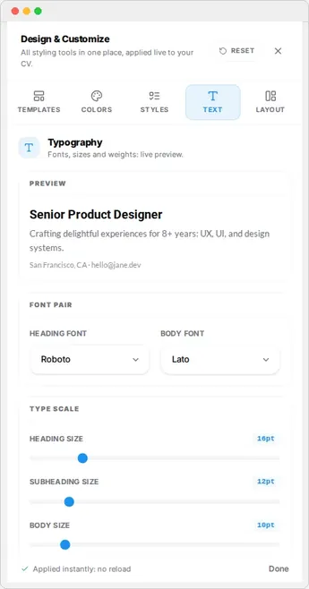
Typography shapes how professional your resume feels. The Text tab in the Design & Customize rail lets you choose fonts, adjust sizes, and control line height so your content reads cleanly on screen and on paper.
Choose fonts
Pick a heading font for section titles and a body font for your main text. Resume Builder HQ offers curated font pairings that work well together, including reliable ATS-friendly choices.
Note
Tune sizes and line height
Adjust the heading and body font sizes to balance readability with page fit. Line height controls vertical spacing between lines. A little more line height makes blocks easier to scan; less of it fits more content.
Watch the live preview as you adjust. The goal is a resume that looks balanced and finishes at the page length you want.
Preview before you export
The preview always reflects your text settings. When the resume fits one page and reads well, move on to the Download step.